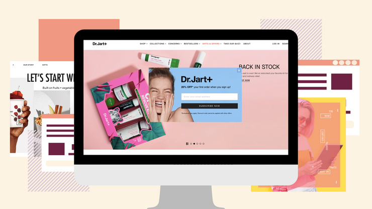
All marketers know the importance of landing pages. Lead generation is optimized through the use of suitable, and appealing, landing pages and the forms that appear on them. The reason behind the higher lead generation rates is the single purpose of these specifically designed pages as they tend to remove distractions and provide the opportunity for an offer to appeal to viewers more simply by narrowing focus.
While the necessity for good landing pages is prominent, many marketers fail to attain the desired results. This is due to the fact that, like everything else, creating that effective end product is difficult. In this article, we have compiled 8 top tips to help you overcome this and fix any errors that might be lurking in your landing pages. Killer landing pages, here we come.
1. Develop Consistency Between Ads and Landing Pages
As users, we all know how irritating it could be to click on an ad only to find that the place we’re navigated to is telling us a different story. As obvious as this point may seem, it is one of the most common mistakes among advertisers. Don’t stop at just the message you’re trying to convey; pay attention to every single detail, including visual elements. Your ads must – and I can’t stress this enough – consist of a steady visual flow. To put it simply, it’s not recommended to look at your ad and your landing page as two separate elements, but rather as two stages of the same process. Through consistency, you manage to create a relevant experience for users and increase the likeliness of a lead capture.
2. Maintain Simplicity
We should cram as much information as we possibly can in our landing pages as to have more to say to persuade the viewer to turn into a lead, or maybe even a conversion, Right? Wrong. The last thing a marketer would want is to overwhelm potential customers and scare them away. The information should be easy to absorb. The best way to go is to keep everything simple, neat, and to the point, removing all distractions and confusing objects. Focus on your offering and its supporting materials and forego fancy additions.

3. Make your landing page and its form mobile-friendly
This one is completely detrimental to the quality of your landing page. A killer landing page, with its beautiful design and engaging layout, might as well not exist if it is not going to work properly on mobile devices. The on-the-go nature of cellphones gives rise to the urge of impulsive purchases and sudden decisions. Therefore, you need to make your forms as easy to fill out on a mobile phone as possible to make it more likely for people to convert. You give them smooth and effortless and they’ll give you leads. Sounds fair to us.
4. Highlight the Offer’s Value
Make sure that the benefits of the offer are clearly stated in a short and simple manner and avoid droning on and on in long paragraphs that nobody will really read. Your text needs to impel the reader to take the desired action, be it downloading a file or submitting their contact information in a form, so only providing information about how amazing your offering is will not do. Instead, take the in-your-shoes approach and clarify on how the product or service is beneficial from the customer’s perspective. For instance, you could say that your automatic coffee maker saves time in the morning by providing fresh pre-prepared coffee the moment you wake up as an alternative to just explaining the technical options.
5. Pay Attention to Your CTA
More often than not, the Call-to-Action feature is neglected, with a word like ‘submit’ worming its way into as many landing pages as it can. While you may think “So what if my CTA isn’t special when every other inch of my landing page is?”, this is something that couldn’t be left off of our list of tips. A compelling Call-to-Action is crucial and makes all the difference in your viewer’s decision to proceed or leave.
To make better CTAs, concentrate on the wants and needs of your customers. For example, if you want to promote a free online marketing e-book, use ‘send me the free e-book’ or ‘I want to learn marketing’ instead of ‘submit’ at the end of your form. How does that dreaded word even relate to your viewers’ wants in any way?
6. Determine the Amount of Information You Need
There is no hard rule for the number of fields you should add to your forms to get maximum benefits. It all depends on the amount of information you require for a lead to be considered as valid. There are some points to take into consideration when deciding on the quantity of fields to be filled out. The lower the time and the effort it takes to complete a form, the more likely people are to do so; however, the more information they provide, the better it is for you.
To put it into perspective, a lead occurring in despite of a long, and relatively time-consuming, form is of higher value and quality as the offer must have seemed worth it to them. The best way to go about it is to only ask for what you need and nothing more or less. It may take a little bit of trial and error to conclude on the best volume of information to request for.
7. Keep Users on the Landing Page
You may be able to redirect users to your landing page, but can you keep them there? One mistake a marketer can make in this regard is letting there be links to take the user away from the landing page to other irrelevant pages. One solution to help reduce the lead-destroying issue of viewers leaving is to have no navigation bar. The landing page should be a single page that does not contain distracting buttons or links that tempt the user to click on them.
8. Tap into The Customer Mindset
Fancy words, technical language and business terminology may make your landing page seem extremely professional, but they will probably make it too professional for your audience to decipher and understand. The consequences are evident; if your prospective customer doesn’t relate to your content, a lead or conversion is lost. Write from the perspective of the customer in a way such that customers feel like they’re reading their own thoughts. To achieve this, prioritize and focus on their needs and wants. Conversions happen when your audience feels understood.

Creating lead and conversion maximizing landing pages that stand out is possible with the right tips and tricks. All you have to do is to make sure that your landing page format works for your offering, your form is easy to fill out, your information is sufficient, and your design is inviting yet simple.
If you find that you need expert help with your marketing, get in touch with Xino Digital for a consultation today!


great